Category, product and brand story pages for a heritage Italian leather brand, designed to feel as personal as the shop in Chelsea and to make it easier to buy online.
Small team, an existing Shopify theme, limited shoot budget
01 · At a glance
A shop with almost forty years of stories, and a website that didn't tell them
Challenge
Customers loved the Chelsea shop, but online the brand felt generic: no pages about the makers or materials, and product pages that left questions unanswered.
What I did
Re-merchandised the category grids, rebuilt the product page and created three brand story pages from scratch: Craftsmanship, Sustainability and Meet the Team.
Result
Average order value grew from £83 to £150+, with a site that now sells the brand as well as the bags.
02 · The brief
Bring the shop-floor experience online
Franchetti Bond has been making Italian leather bags, shoes and clothing since 1987, with a shop in Chelsea where the team knows customers by name. That warmth, and the craftsmanship behind every piece, wasn't coming across online.
I set myself three goals: make the category pages easy to browse on a phone, answer customers' questions on the product page before they need to ask, and give the brand a voice with pages about where and how everything is made.
Working within limits. With one developer and an existing Shopify theme, I focused on the changes that could be made directly in Shopify: merchandising, imagery, copy and page layouts. Bigger structural ideas are listed under What's next.
03 · The old site
Where it started
Before the redesign, I walked through the site the way a customer would: homepage, category, product, cart. Scroll inside each screen to see the whole page.
1 · Homepage
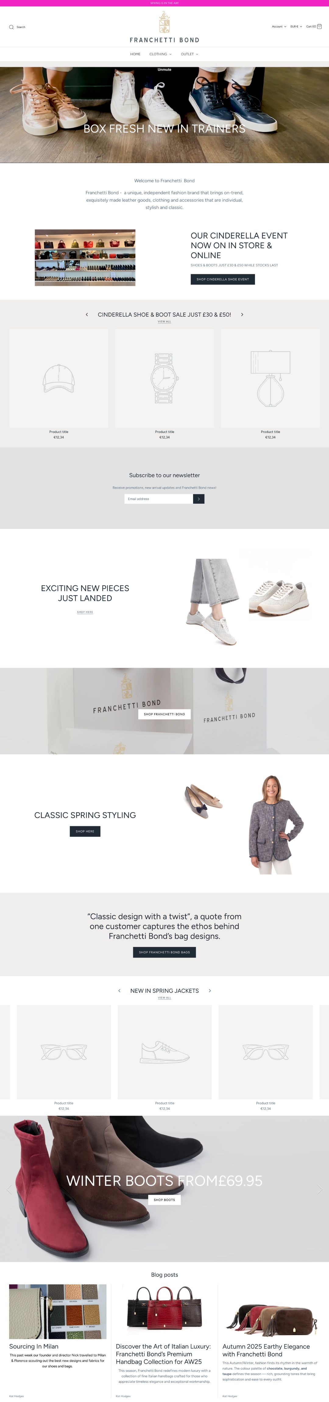
Spring, a shoe sale and winter boots all at once, and two product carousels still showing the theme's placeholder products.
2 · Category
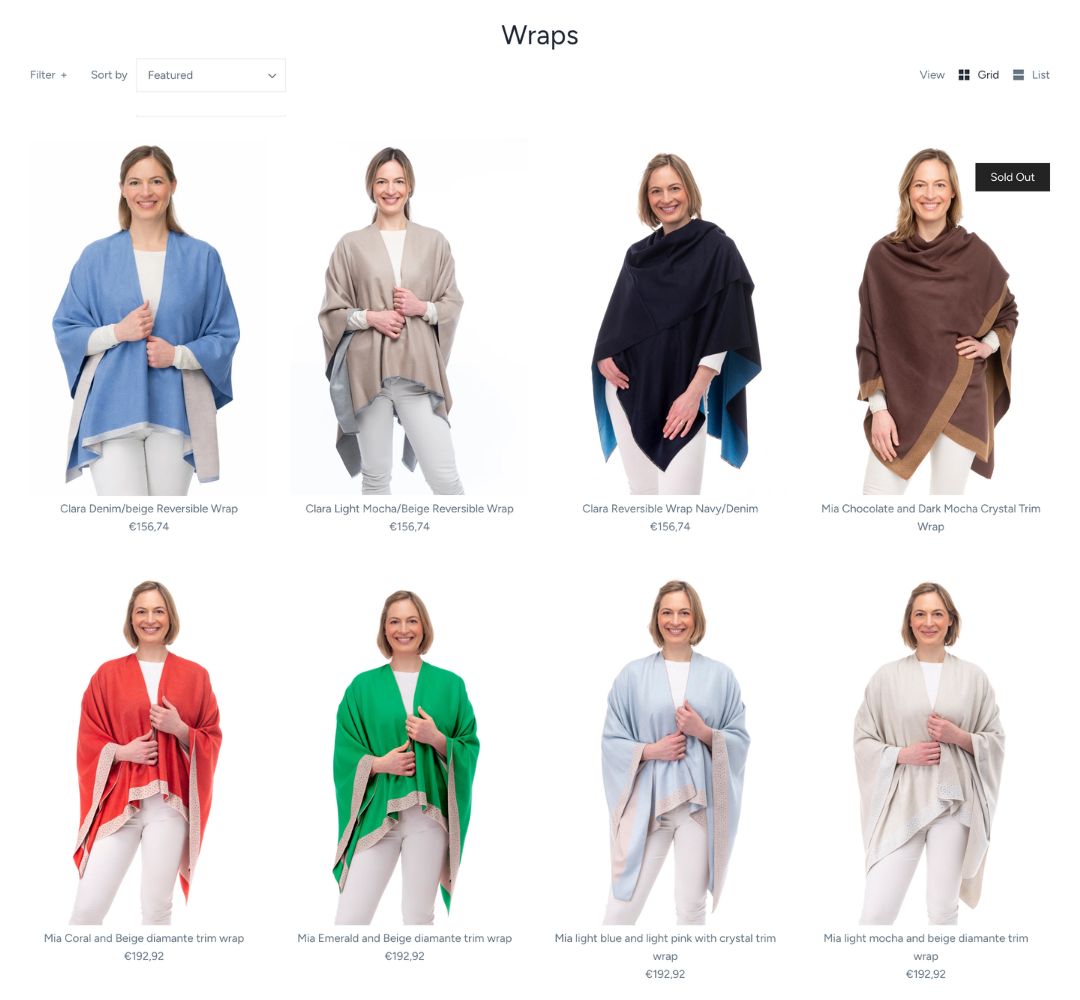
Colours in no particular order, a sold-out wrap in the first row and long names wrapping onto two lines.
3 · Quick view
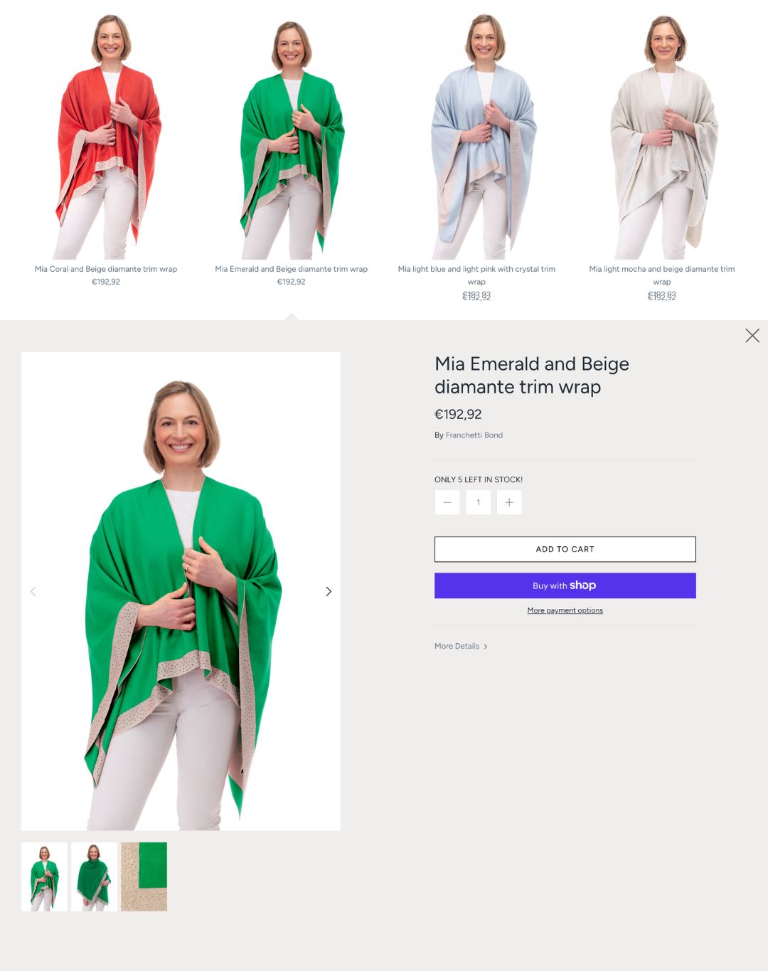
Clicking a product opened a panel inside the grid, with no description, sizing or care details. The full page was hidden behind "More details".
4 · Product page
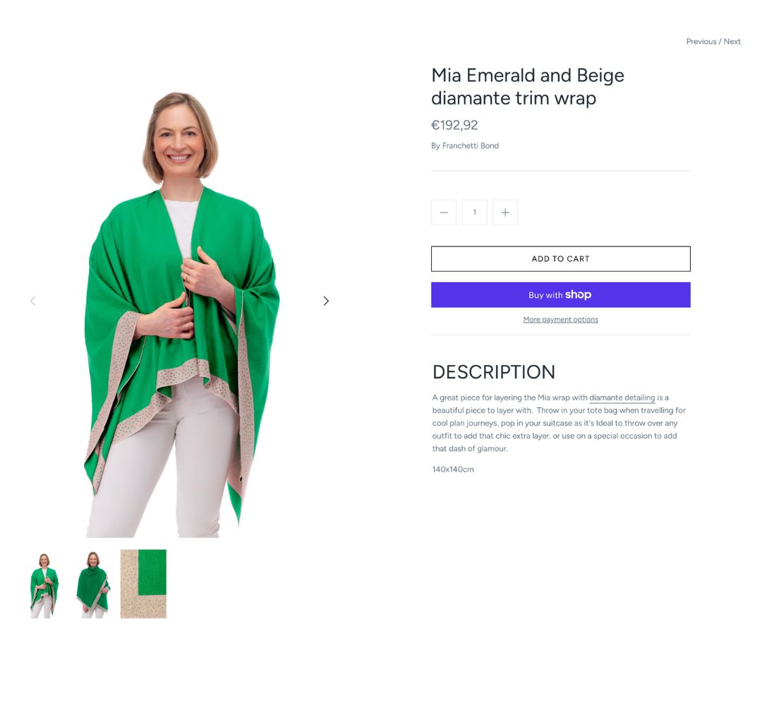
One paragraph and a size. The bright purple Buy with Shop button was louder than Add to cart, and there was nothing else to discover.
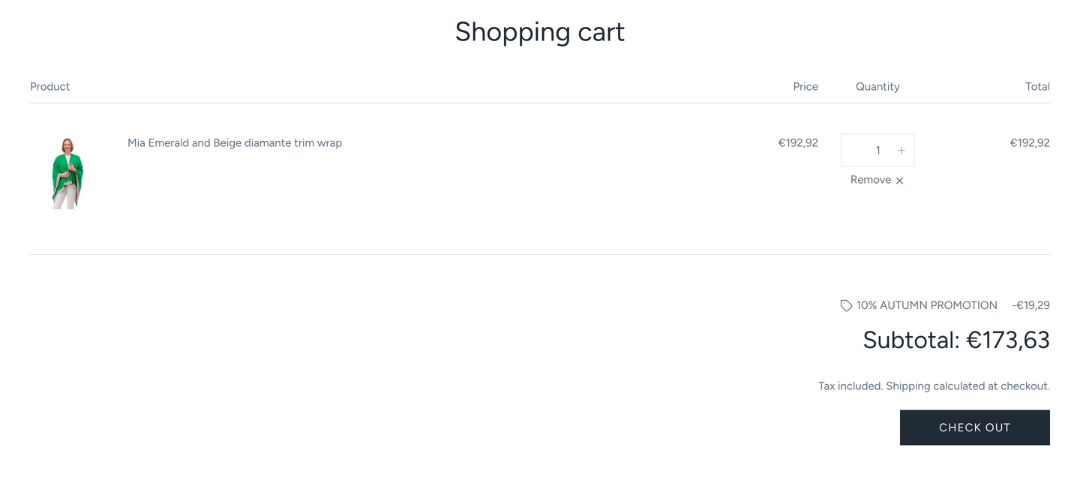
5 · Cart
A single item and a Check out button: nowhere along the way suggested a second piece.
Decisions across every page
Keep the theme, change everything inside it
BeforeShopify theme, set up with its defaults
AfterThe same theme, restyled section by section
Why
A new theme would have meant rebuilding every page and retesting checkout. Working inside the existing one let changes go live one page at a time, with no downtime.
Constraint
One developer, shared with other work. The filters, sort menu, grid/list toggle and quantity buttons are unchanged because they're fixed by the theme.
A serif for headings
BeforeA rounded sans-serif in capitals for everything
AfterWidely spaced serif capitals for headings, a light sans-serif for reading
Why
The serif matches the crest and the shop's signage, and says Italian heritage before a word is read. Keeping the body text sans-serif keeps it readable at small sizes on a phone.
Constraint
Fonts had to come from Shopify's built-in font library, with no custom font files.
Softer, rounded buttons
BeforeHard-edged rectangles, some filled and some outlined
AfterOne filled, rounded slate button for each main action
Why
One button style means customers always know what to press. The rounded shape echoes the curves of the bags and feels friendlier, like the shop.
Constraint
Button shape and colour are site-wide theme settings, so the change had to work on every page at once.
Prices that look considered
BeforeConverted prices like €192,92
AfterPounds, with set price points: £99.95, £159.95, £189.95
Why
Most customers are in the UK. Round, repeated price points make a range feel planned and make it easy to compare one bag with another.
Constraint
Prices are set by the business; my part was how they're presented and grouped on the page.
04 · Category page
A grid that reads as a collection
Tap a number on the screenshot, or a note beside it, to see the thinking behind each part of the page.
Bags · category page
Before & after · drag to compare
BeforeAfter
The decisions
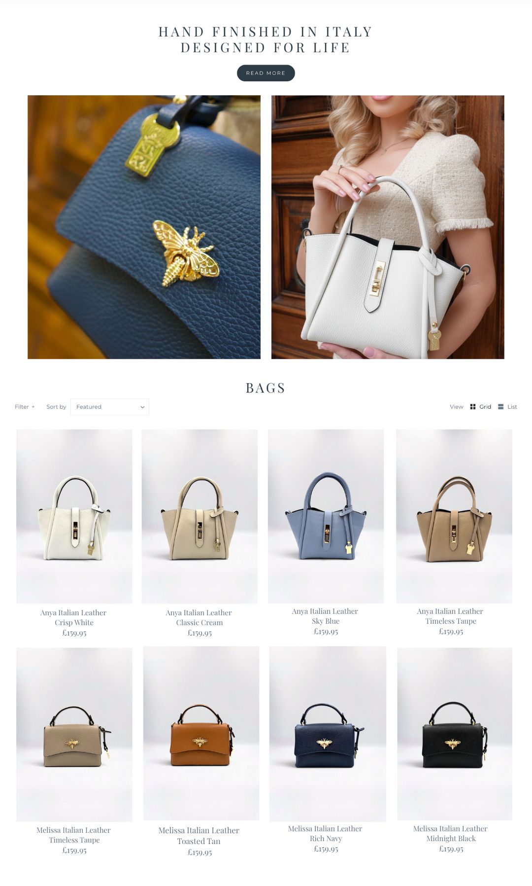
Open with a promise, not just a title
BeforeThe category name, then straight into the grid
After"Hand finished in Italy, designed for life", a Read more button and two large photos
Why
Someone arriving from Instagram or Google may not know the brand. One line tells them why these bags cost what they do, and Read more leads to the Craftsmanship page for anyone who wants the story.
Constraint
It had to be short enough that the first products still show without much scrolling, using the theme's existing banner and image sections.
A close-up and a carried shot, side by side
BeforeNo imagery above the grid
AfterA hardware close-up next to the bag being held
Why
Online, customers can't touch the leather or try the bag on. The close-up stands in for touch, the carried shot for size: the two questions the shop team hears most.
Constraint
A small shoot budget, so I chose two images that each answer a question rather than a bigger campaign banner.
Group by style, then light to dark
BeforeStyles and colours mixed in no particular order
AfterOne style per row, colours running from white to black
Why
It's how a shop shelf is merchandised: shoppers compare one shape across colours, then move on. It turns eight products into two clear choices and makes the range look bigger and more planned.
Constraint
The theme lists every colour as its own product, with no colour swatches, so the order had to be set by hand in each collection.
Sold-out and broken sizes move down
BeforeA Sold Out label in the top row
AfterOnly products that can be bought in the first rows
Why
The top rows are the most valuable space on the page. Filling them with things people can't buy wastes the first impression.
Constraint
Without an app to sort automatically, I check stock and re-order collections by hand.
One studio look for every product
BeforeProducts shot on a model, crops and scale changing from photo to photo
AfterEach bag on the same soft grey backdrop, same angle and size, retouched to true colour
Why
When every photo matches, the eye compares the bags, not the photos. True colour also means fewer surprises when the parcel arrives.
Constraint
Shot and retouched in-house with a small budget; a fixed backdrop and set-up made it repeatable for every new arrival.
Names that are short and sound good
Before"Mia light blue and light pink with crystal trim wrap"
After"Anya Italian Leather / Sky Blue"
Why
Style, then material, then colour fits on two short lines in a phone grid. Colour names like Timeless Taupe and Toasted Tan sell a feeling as well as describe.
Constraint
Product titles also feed search and Google Shopping, so each needed to keep "Italian Leather" in it.
05 · Product page
Answer the question before it's asked
Stella Woven Leather · product page
Before & after · drag to compare
BeforeAfter
The decisions
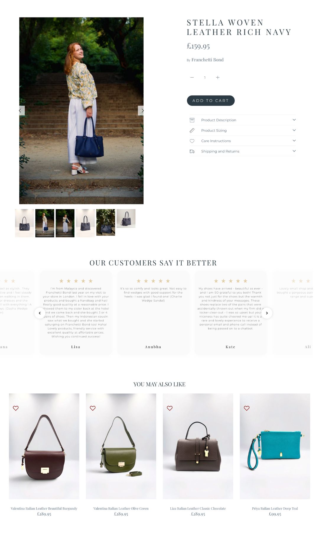
Clicking a product opens the product page
BeforeA quick view panel opened inside the grid
AfterEvery click goes to the full product page
Why
The quick view had no description, sizing or care details, and most customers never went further. For a £160 bag, people need the whole story before they buy, not a shortcut.
Constraint
Quick view is a theme setting, so switching it off was simple; the work was making the product page worth the extra click.
Open the gallery on the bag being carried
BeforeThree photos, all in the studio
AfterSix photos, starting with a lifestyle shot, then studio and detail
Why
The first photo answers "how big is it, and how would it look on me?" The studio and close-up shots that follow show the colour and the leather.
Constraint
Lifestyle shoots are expensive, so each one was planned to cover several products, and the studio shots reuse the same set-up as the grid.
One button to buy
BeforeAn outlined Add to cart under a bright purple Buy with Shop button
AfterOne filled, rounded Add to cart
Why
The purple button was the loudest thing on the page and not in the brand's colours. One clear action keeps the page calm and the decision simple.
Constraint
Fast payment options are still offered at checkout, so no one loses the option; it just doesn't compete on the product page.
Answers in four drop-downs
BeforeOne paragraph and "140x140cm"
AfterDescription, Sizing, Care and Shipping & Returns, each with an icon
Why
I wrote them from the questions customers ask in the shop and by email. Drop-downs keep the page tidy while every answer is one tap away, and icons make them quick to scan.
Constraint
Each answer had to be written for every product by hand, so I made templates for each type: bags, shoes, clothing.
Let customers say it
BeforeNo reviews
After"Our customers say it better": full, real reviews in a carousel
Why
Small brands have to earn trust. Long, personal reviews about the team and the quality do that better than star ratings alone.
Constraint
Reviews were collected from emails and messages, with each customer's permission, rather than through a paid reviews app.
Something to add before checkout
BeforeNothing to discover after the product, and a cart with one item
After"You may also like": similar bags plus a lower-priced accessory, with a wishlist heart
Why
A £99.95 pouch is an easy yes next to a £159.95 bag. This is one of the main reasons average order value went from £83 to £150+.
Constraint
The theme's recommendations block, with products chosen by hand, rather than a paid personalisation tool.
06 · Brand story
Three pages that didn't exist before
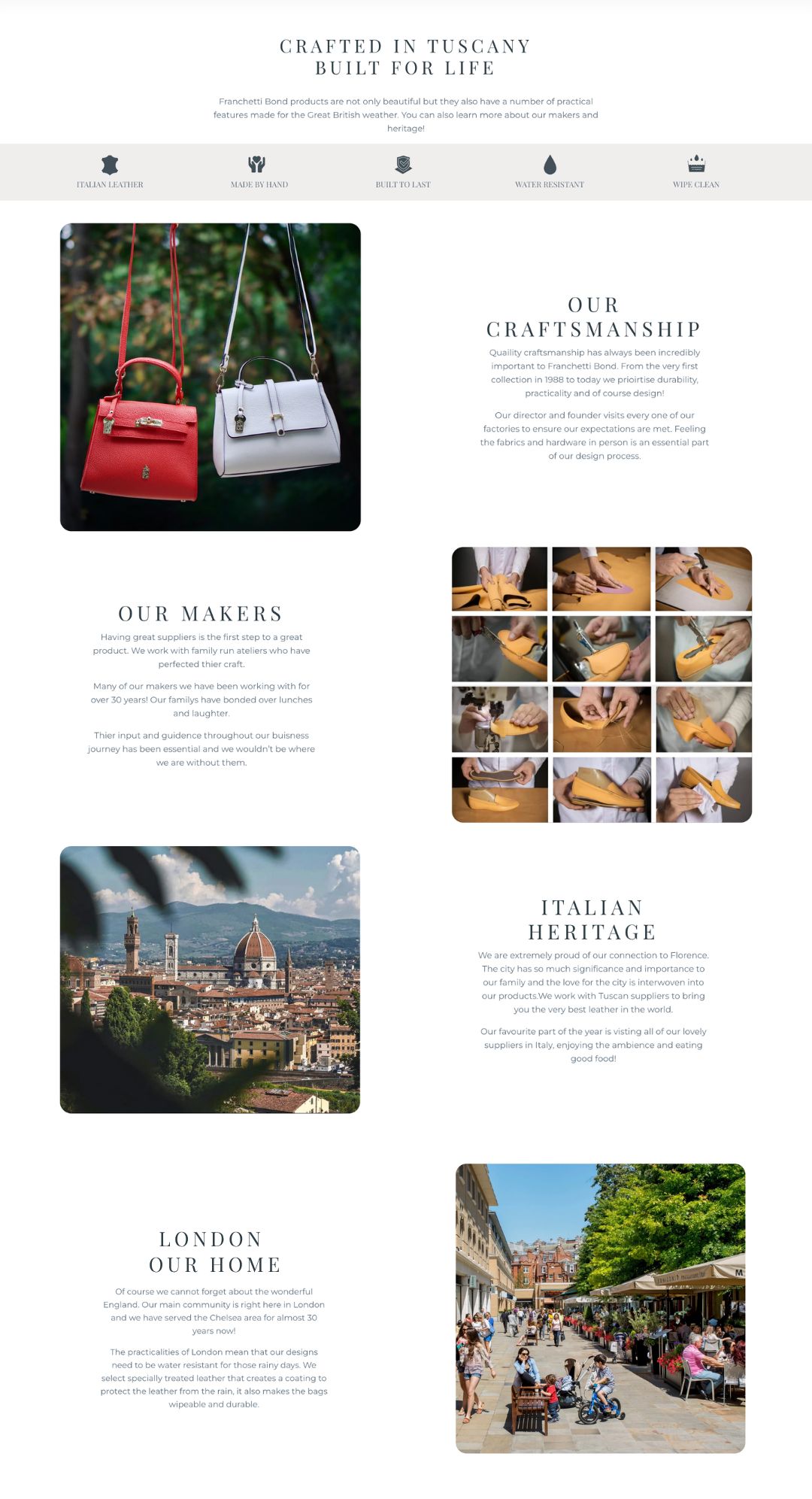
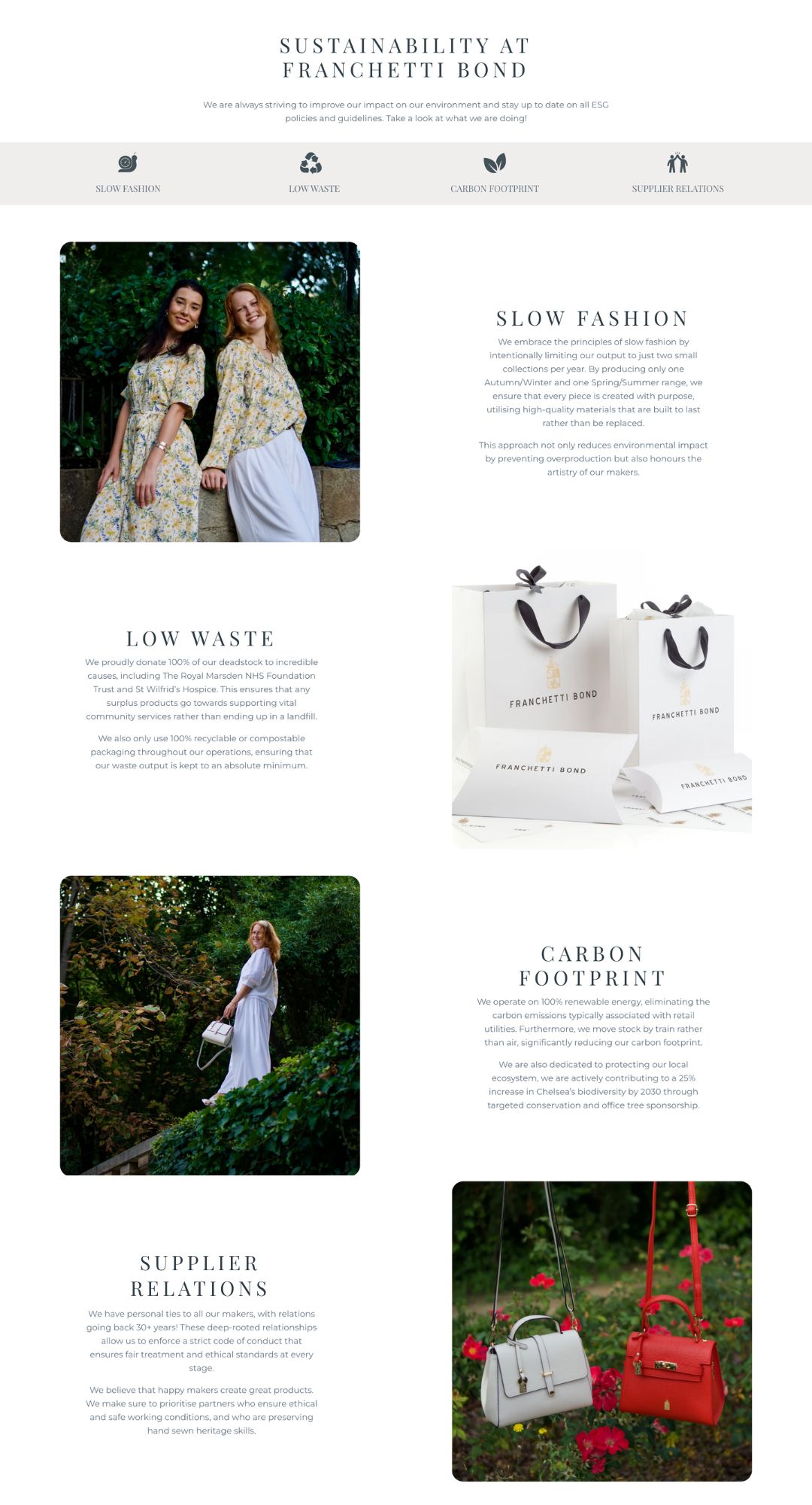
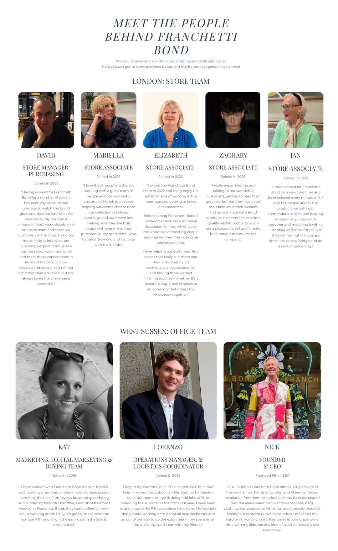
Craftsmanship, Sustainability and Meet the Team were my idea, from concept to copy and layout. They give customers a reason to trust a £160 bag from a brand they may not know yet.
BeforeThis paragraph on the homepage was the whole brand story. Nothing about Florence, the makers, London or the people in the shop.
Craftsmanship
Sustainability
Meet the Team
The decisions
Three pages, three questions
BeforeOne paragraph on the homepage
AfterCraftsmanship, Sustainability and Meet the Team
Why
Each page answers something customers ask before spending this much: is it well made, is it made responsibly, and who am I buying from?
Constraint
Built as standard Shopify pages from the theme's own sections, so the team can update them without a developer.
Icons first, story second
BeforeNo summary of what makes the products different
AfterA row of icons under each headline: Italian leather, made by hand, water resistant…
Why
Most visitors skim. The icons give the key points in two seconds, and work as a contents list for anyone who keeps reading.
Constraint
Simple single-colour icons that match the text colour, so they look right in the theme without custom artwork.
Zig-zag photo and text
BeforeUnconnected banners stacked down the homepage
AfterPhoto and text blocks alternating left and right, with rounded corners
Why
The rhythm keeps a long page easy to scroll and gives every paragraph its own picture. On a phone the blocks stack neatly, photo then text.
Constraint
The theme's image-with-text section, reused rather than custom-built.
Specific facts instead of slogans
Before"Unique, on-trend, individual, stylish and classic"
AfterFounded in 1987, makers for 30+ years, deadstock given to named charities, stock moved by train
Why
Any brand can say it's stylish. Dates, names and numbers are what make a small brand believable.
Constraint
Every claim had to be true and checked with the founder, especially on the Sustainability page.
Real faces, in their own words
BeforeNo team on the site
AfterEveryone grouped by place (London, West Sussex, Barcelona) with their role, start year and a quote
Why
The people are what customers love about the Chelsea shop. Seeing them online makes buying from a small brand feel personal, and regulars recognise the faces.
Constraint
No budget for a team shoot, so I used photos people already had and kept the cards the same size so the mix still looks tidy.
07 · Results
What changed
£150+
Average order value, up from £83
80%+
More spent per order
3
New brand story pages, from idea to launch
08 · What's next
Shipped, and what I'd do next
Shipped
Re-merchandised category grids, sequenced for mobile
Consistent, colour-accurate product photography
Product pages with sizing, care and delivery answers
Cross-sell with lower-priced accessories
Craftsmanship, Sustainability and Meet the Team pages
With more resources
Group colourways into one product with swatches, to free up grid space
Fit and size guidance right beside the price
A sticky Add to cart bar on mobile
"Complete the look" pairings on every product page
The craftsmanship icons repeated on each product page